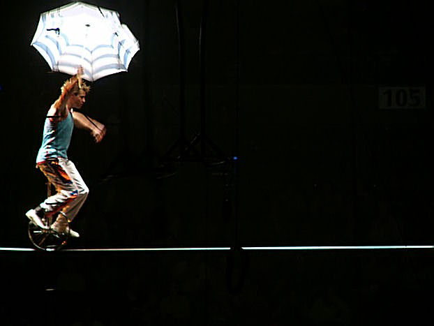
The darkened bacground against the lighted performer will be understood by most voters as meeting the darkness challenge. The detail in the darked area is visible but not enough to identify exactly what is going on there and tends to draw the eye away from the main subject. This will be interpreted as distracting by some viewers. Especially distracting is the blue dot in the center. You might consider making some or more of the darkeened area brighter to show what is back there or make it totally black all together to remove it as a distraction.
The general image quality of your main subject is not especially good. Colors seem oversaturated and the focus is very soft. This will likely lower your overall score.
I like the non-centered composition here. Did you want some details of the dark parts to remain visible? I can see a sign that reads 105 and some stuff hanging from the ceiling. You could have gotten rid of those with Levels. 7.





 Add photograph to your favorites
 Add photographer to your favorites


 Photographer found comment helpful.


