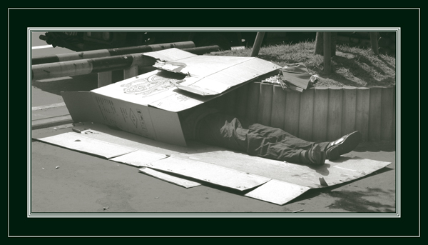
I wasn't out looking for this shot. This is just a place that I had to walk past towards the subway station that I needed that day. I really enjoy street photography. My friends often think that I am cruel to take photos of destitutes and such but I think that it is a way to show others that it exists and raise awarness.
Statistics
Place: 166 out of 373 Avg (all users): 5.0584 Avg (commenters): 5.4375 Avg (participants): 4.7177 Avg (non-participants): 5.3114 Views since voting: 891 Views during voting: 412 Votes: 291 Comments: 19 Favorites: 0
If it wasen't for the frame it would have pointed the double to me, this way is the midle of the scale. Good subject, good chice of b&w for dramatic aproach, laugsy border, and complex too.
This is an image that looks like a comedy skit - sadly, it is not, right?! - nice image - I would have bumped up the dark areas to get the full spectrum - 6
Certainly a subject worthy of the challenge topic. The image has no serious hot spots and the greyscales are generally good. B&W is a good choice for this subject.
The border takes up a considerable percentage of image real estate and may be considered distracting to some viewers because there is no obvious way it supports the main subject.
Technically there are a couple aspects of this image that will keep it's score lower. The image is low contrast. This is made even more pparent by your black border. You should set a black point for it or darken blacks using selective color black adjustment or channel mixer slider adjustments. Perhaps you used low cotrast on purpose. If so, it will not work with most voters.
The image is presented from the "snapshot" perspective. It appears to have been taken simply while walking by. A different perspective like ground level may have been more interesting to the viewer and connected better to the theme of being down and out. Consider a closer crop to more closely highlight the person themselves.
for me the added border really detracts from the image. The frame looks like some fancy oil painting frame & doesnt suit the subject matter. So much soild black also makes your image see watered down because you have no equal blacks to match the frame. Good image, just bad choice of border.
I like the concept and the sense of hopelessness it invokes, but something keeps it from "popping". Compositionally, the tree trunks serve to draw my eye out of the picture frame. And speaking of picture frame...It's a little much to suite me.
This is an interesting approach to the challenge. One of the few pictures that work well even though they're not dark.
I think your border is an over-kill, one or two plain lines would have been enough. Some more contrast for the picture would have improved the quality. 8.
Not sure the border adds to the image. Perhaps it would have been better in black - which mich have helped balance the more gray feel in the image itself. Very good take on the challange, though. 5







 Add photograph to your favorites
 Add photographer to your favorites


 Photographer found comment helpful.


