Drove around the whole morning to get some good tulip shots so that I can beat Kiwiness for this challenge. I have some nice colorful landscapes, but because of the sunny weather all the flowers have such powerful colors that they don't look that well. It is also hard to find a good background for the fields, just a field of tulips is too empty imo.
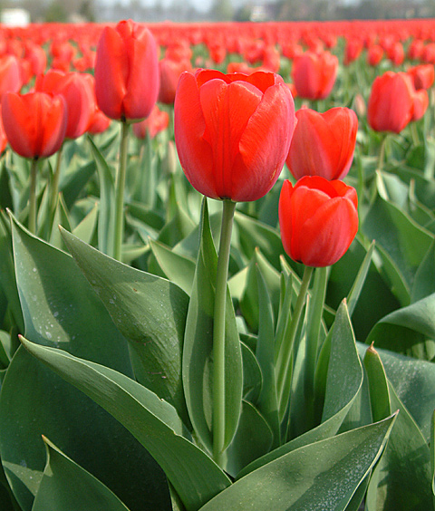
This field is near where I live, I could get on the land easily and did a few closeups. Up close looked the best so I selected this one. Clean, simple, powerful.
Rotated to the left, cropped a bit of the bottom, resampled, unsharp mask.
Camera: Aperture priority handheld, soft, 6mp.
Lets see what Kiwi comes up with, I advised him to go to Holland this weekend for the tulips. He will probably beat me. :)
Statistics
Place: 35 out of 139 Avg (all users): 6.1838 Avg (commenters): 7.2941 Avg (participants): 6.1959 Avg (non-participants): 6.1538 Views since voting: 1380 Votes: 136 Comments: 19 Favorites: 0
He he! Well Az I didn't enter anything for the flora challenge cos I knew you were out after me :-) Good score anyway, you sure live in the right part of the world for tulips!
Nice field of red. The composition of this is very effective. The leaves transition into the red blooms in a very pleasant way. I'm going to give it 10.
Great shot, but the leavs in the cneter seem to be more in focus than the Tulip itself. Or perhaps the red is a bit intense and washes out the focus. Who cares, it's a great picture.
The point of view here works fantastically as the tulips fade to a red blurry line! Nice DOF too. The colors seem a little too "pushed" and unnatural, but your concept works well.
excellent work... the red and green contrast nicely and I really like the way this field of tulips 'levels' off across the top of the frame :) - setzler
I had to look hard to find anything negative here....this is just such a good shot. The horizion is not straight and that is a bit of a bother. Other then that one small remark....this is so good. Lush red.
the green is wonderful, but the red is a little saturated. i like the forground diagonal lines and think that the mid to background levelness adds to the pic.
Repetitiveness makes this photo... at first I was thinking it was too centered but when I looked at the whole photo I kind of like it that way... Nice colors and good use of DOF.







 Add photograph to your favorites
 Add photographer to your favorites

 Photographer found comment helpful.


