Thank you for all your comments on my photo. I have learnt alot by what you all said. This is my first entry for the challenge and I have certainly gained some knowledge about taking a 'better' 'clearer' shot. Just for your interest, if you would like to see the little girls face in that photo, you can view her in the B&W challenge. The photo is called 'Dazed'. Thanks again!!
The horizon line is a little crooked and the compression in this picture is very apparent. Your file size is about 1/3 what it could be -- perhaps that's the best your camera can do? If not, try taking "larger" pictures and resizing them and saving them without so much compression.
Interesting photo, I see some artifacts from the software resize. Check out the forums for some suggestions on how to clean that stuff up. Still like the shot though.
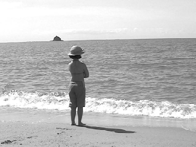
Very painterly. The girl's shadow is awesome, as are the footprints in the sand that lead up to her. The fact that she's wearing that hat make it seem very old-timey...sort of has a 1920's feel to it.
I like this photo, but the subject is too dark. The natural lighting is all on her left side. Moving the camera to the left would help take advantage of the natural light. An alternative might be to use fill flash, but this might cause problems with the shadow.
i think i would have zoomed in at a different angle to crop most of the emptiness away--or at least to have the emptiness following an angle in front of her, not surrounding her. also, this seems overly compressed. still, a great concept for the people challenge!
Picked up some jaggies, possibly started with too low of resolution or blew up the shot too much. The best example is her shadow, but it shows up throughout this photo. Try starting with the highest resolution your camera will support and crop down as little as possible. Photo 7 (sorry, the jaggies are that bad, would have been a 9 otherwise) Creativity 7 People 7 total 7 Just for arguement's sake: Why black and white? This would have been a good choice for color, but I did NOT score you down for this. This is my problem issue, not yours. Keep on shootin'!
Wow it looks like you had a great photo here but saved it with too much compression. The rules state you can have up to 150kb and your file is less than 50 kb.
Very nice composition. I like that the woman isn't smack in the middle of the shot. In fact, I think she could be even further to the left to follow the rule of thirds. Now some things that you could try and change for the next time: level your horizon, also, don't compress your file quite as much. It's pixilated and your file is only a third of the allowable size. Also, what made you use b&w? I think sand and sea work generally better in color, but that's just my opinion.
Could have been great, concept and composition are excellent, even works good in B&W. Problem: too highly pixellated! What kind of camera are you using? Did you do any post enhancements?
Totally love this shot. The shadow, her stance......all of it is wonderful. My only little nit is that the shot looks over compressed and a hair OOF. Nice work.
This could be a nice shot, but compression artifacts are very visible here - the girls shoulders and hat are all blocky. I can understand that effect in the ocean, but the subject should be a little sharper. This may be overly compressed
Great shot! It looks like the jpeg compression was a bit much though. This picture needs to be sharper which I think was lost in compression. Really like the composition.







 Add photograph to your favorites
 Add photographer to your favorites


