Sorry for the form-letter type commentary. I’m going to try to give almost everyone at least this breakdown to start. I would be happy to offer a more detailed opinion if you would like, though I don’t consider myself a very knowledgeable photographer.
Here is how I broke down my score for your submission.
Content: 2/4 (Is the subject compelling? Does the choice of content match the challenge?)
Composition: 1/2 (Is the work well balanced and successful?)
Color/Light: 1/2 (Is light and or color used with skill and artistic intent?)
Clarity: 1/2 (Is the picture in focus? Are the elements clear?)
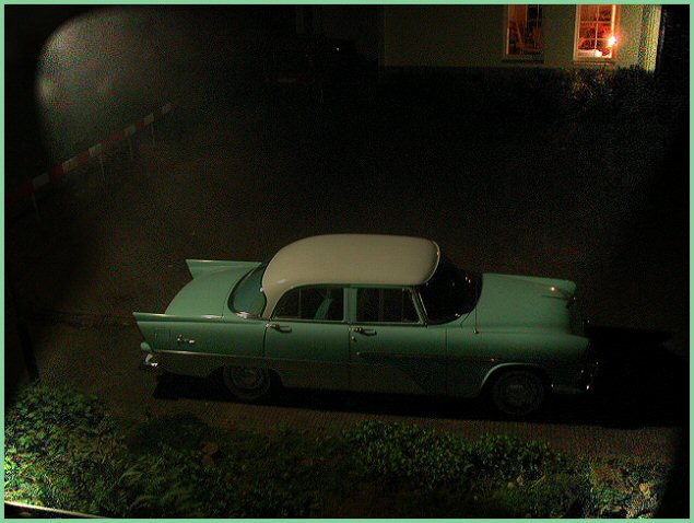
It looks like it was raining a bit when the photo was taken - but it's hard to tell. It appears that the image was saved with a relatively high compression setting, which has resulted in some jpeg-artifacts - especially in the top-left corner. I would suggest using a higher quality setting when saving your next image to make sure your photos are presented with the high quality they deserve.
some nasty artifacts hurts this image (but luckily doesn t kill) and thats a bloody shame cause this is one of the more original entries in this challenge imo
well done!!
I really like the concept, the car, and the image. The light on the upper left bothers me a bit, as does the object in the lower left. I wonder if a tilted crop could have removed those objects, but kept the car & neighbor's window intact.





 Add photograph to your favorites
 Add photographer to your favorites


 Photographer found comment helpful.


