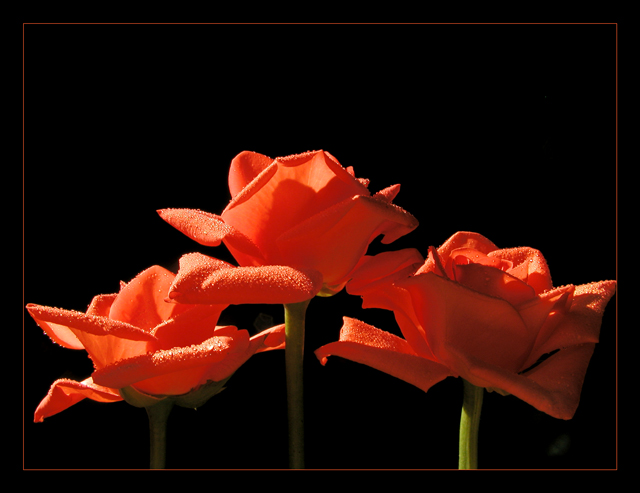
There are a lot of photos in this challenge with flowers on a black background. Some work and some don't. If the lighting is wrong, I feel like the blackness sucks all the colour and life out of the photo. I think this one is borderline. The right hand flower is a little too much in shadow, but the brightness of the highlights and the nice curles to the petals are good. I'm not a big fan of covering flowers in teeny water droplets myself.
Very nice color and I really like the water droplets (nice!). Focus seems strong, lighting is good, framing is nice. Comment removed, my bad. 8 Rob the Swash
Beautiful colors and lighting! The crop is a little too tight on the red border, the flowers may have benefitted from a little breathing space at the sides, or maybe enlargen the red border a couple of millimeters - 9.
Good use of empty space... I like the way your flowers look like they are facing away from you... it adds to the title by making it look like its in the past. Beautiful use of water droplets, and pretty good lighting. The spot in the bottom right hand corner is slightly distracting but not too bad. Very pretty picture overall. Nice job!
The droplets of water on the petals give these flowers an almost satinny look. The light adds a deep complexity to this otherwise simple image. Nice job.
beautiful job with the lighting... the only minor issue here is that the lighting on the right stem is a little brighter than the rest... it sorta makes it stand out a little much... great shot though :) - setzler
Lovely shot. The overall composition and tones are nice. A sharpen after the resize would have made the water drops 'pop'. This is in my top 10 this week! -danny
It's a beautiful photo of stunning flowers. Looks like a studio shot however and as the suject is flora (meaning in the wild) I shall mark it down a little. In any other suitabvle category however I would give it a 10





 Add photograph to your favorites
 Add photographer to your favorites


