Boy, I had a feeling this was yours, Robert. Nice shot and nice treatment. Not the best in the challenge obviously, but definitely a likeable image. I gave it a 6.
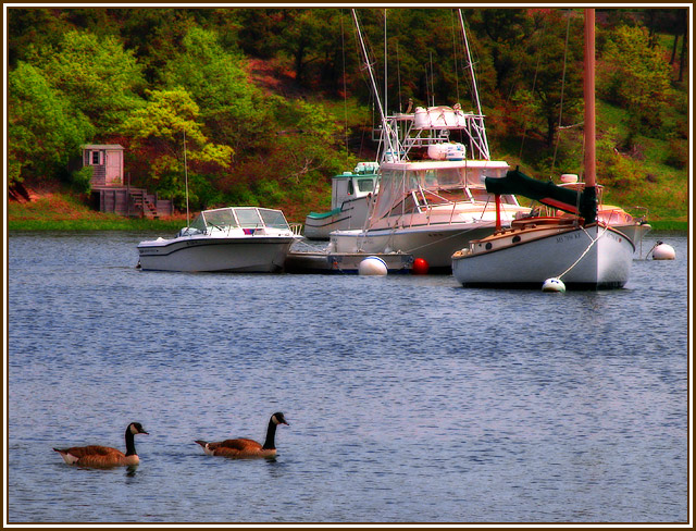
the combination of the photo plus whatever filter you applied is too wierd for my personal tastes... imo the foliage looks decent, the boats are pink tinted and the ducks look like theyve been cut and paste-d on the water.
This is lovely. Looks like East coast. Would you mind telling me what tool you used to get this soft but focused effect? I have Photoshop and I know it has this ability, but don't know which or how to use it, do you.
Nice textures and colors - 9
this is a very pleasing image but it has a certain look about it, a softness or glow, that makes it appear heavily processed; and the birds (geese) are a very small part of it's impact
There seems to be such a strange halo around the two geese - I don't know if that's because of an effect filter or because you've selectively processed the water/ birds etc. The whole thing feels soft too so maybe it's all down to a soft focus filter (not a fan myself). I like the composition but the processing doesn't work at all for me.
Based on the exposure and the center of focus, I'd say that this were an entry in a boats challenge. It's a nice boat picture, but the odd color cast does make it feel somewhat artificial.
A lot of colour balance,or saturation, if I hide the background the birds look good, mybe you should have just selected the birds and saturated first,imo....6





 Add photograph to your favorites
 Add photographer to your favorites

 Photographer found comment helpful.


