Nice try.
Keep at it.
Play with the composition.
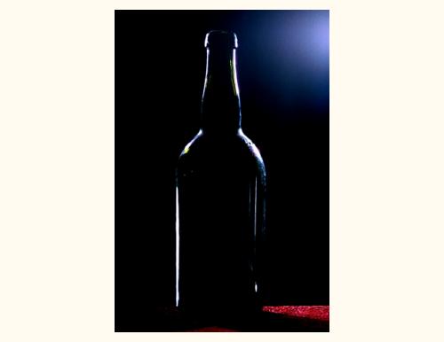
Your red and blue would work better showing through the bottle (distortion and refraction would add some more depth to the photo), plus - don't forget to move your subject according to the rule of thirds.
It's a rule for a reason.
Backlighting the bottle is a great idea and you have a solid black point for the background. It has no more than a tiny amount of electronic noise.
There are a couple things that will hold back a high score for this image.
The general image technical quality is not that high. For the size of the frame the main subject is not very big. You may want to consider taking this in portrait mode.
The small lighted red background is more distracting in the image than supportive.
The border of this image is very, very distracting. You are probably trying to emphasize the idea of darkness through its contrast with the solid white border but that will not work for most viewers.
Interesting concept. I like the way you have laid our your border, but for some reason it doesn't seem to fit the round curves of your subject. I like the blue area in the top right, it adds a certain dynamic to the image.
I'm having trouble figuring out why you would enter an image at so much smaller than the resolution allowed by rules, and use a huge border to make up the difference.





 Add photograph to your favorites
 Add photographer to your favorites


