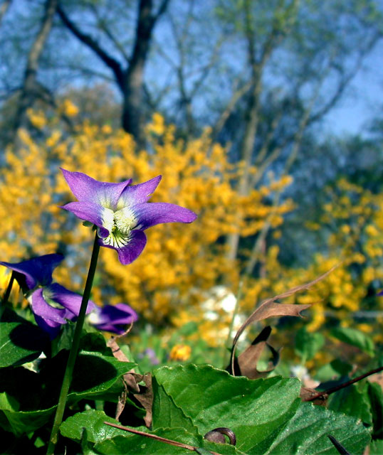
I like the layering of colors, but the difference in sharpness between the fore- and background elements is so stark it looks almost artificial or compositied. That adds to the feeling of depth, but seems a little jarring -- I'd like to see this with a softer overall look. Not sure it would be better, but would be interesting to compare.
I don't care for the composition on this photo... the main subject falls right in the middle of the page... and there is just too much going on. Good use of DOF though... and good colors. I definitely would have cropped some off the top, as for the rest I'm not sure, it's kind of akward.
You should tiddy things up a bit with the dead leaves. Also, i would focus on the violet as the main subject more with the yellow in the background. Right now it look more like the yellow background is the subject.
this is an excellent composition.. i don't know if less depth of field was possible or not but it would help tone down the contrast in the background... - setzler
Nice use of complimentary colors. The focus seems a little sharper on the leaf then the bloom, maybe it's just the light and texture that makes it seem so.
I love the colors. I think I would have removed the brown, dead leaves first, but that is just my personal artistic interpretation. No points off for that. I give it an 8.
The leaves on the bottom are a little bit busy without adding much to the photo. If you cropped them out it would make the flowers stand out more I think.






 Add photograph to your favorites
 Add photographer to your favorites


 Photographer found comment helpful.


