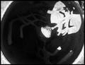
I think this image has potential, but the crop makes for a jarring composition. The horizontal tilt is severe, and has a severe impact on the eyes. The haziness of the image is also something that could be corrected. Two dots, one on each side of the crane, should be wiped off were this an advanced edit challenge. Overall a decent image, but again, the tilt is extremely problematic for me.
Good shot & I like the composition - it's just way off balance with regard to horizontal. Had you corrected/straightened it up, I would have scored it much higher. I know that sometimes shots are taken askew on purpose to add to the effect or mood of the image, but I didn't get that feeling here. Still, as I said, I do like the shot - it just needs a little straightening (IMHO). (5)
I just rode by this last weekend. It's always fun seeing places you know... Regarding the image, the horizon needs to be level, and the midtones are sort of washed out.







 Add photograph to your favorites
 Add photographer to your favorites


 Photographer found comment helpful.


