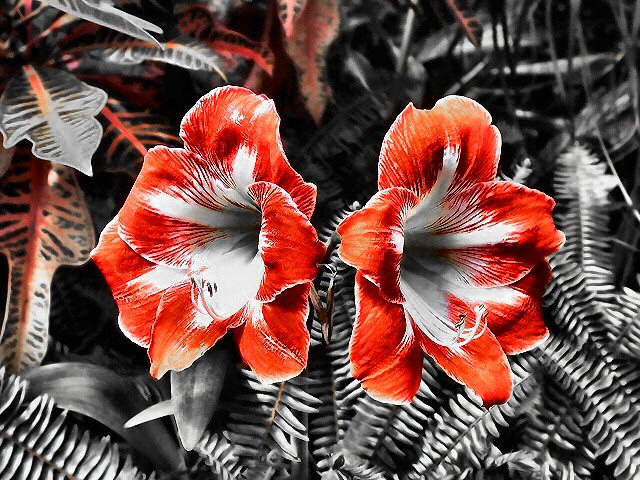
Composition/ Content Great symmetry though overall image seems just a little unbalanced to me – perhaps that there is more space to the left than to the right or the heavier presence of red in the leaves at the top left.
I like the desaturated background and heavily saturated blossoms idea – looks quite unusual to have no greens here.
Background I think it’s a shame that the top left area of the background has reds left in it whereas the bottom right is completely b/w. That adds to the unbalance for me.
Camera Work - Technical Looks fine/
Digital Processing - Technical Seems too sharp to me, but that may just be me.
Fits The Challenge Yes!
My Opinion On The Photo Striking and attractive. Composition isn’t one of my favourites but does add interest.
Amazing composition! I think this stands out so much as its using the 3 most contrasting colors, black white and red. Like a newspaper! I am giving this a 10 and its definitely one of my favourites.
Normally, I don't like pictures that look more graphic than photographic, but this one is particularly effective. The grays make the color of the flower even more bold. I only think the flowers could be a little less centered.
Very nice effect. I like the results of the desaturation of colors other than red in this picture. I like the symmetry of the flowers. Nicely focused. Good luck in the challenge. 9
very well done. i like the partial desat that you did. adds character to the pic. leaves a lot to the imagination for filling in the color of the ferns. I like the almost perfect symetry, also.
I would love to see wha tthis shot looked like before the desaturation. This image shows a lot of harsh contrast with only the red present... - setzler






 Add photograph to your favorites
 Add photographer to your favorites

 Photographer found comment helpful.


