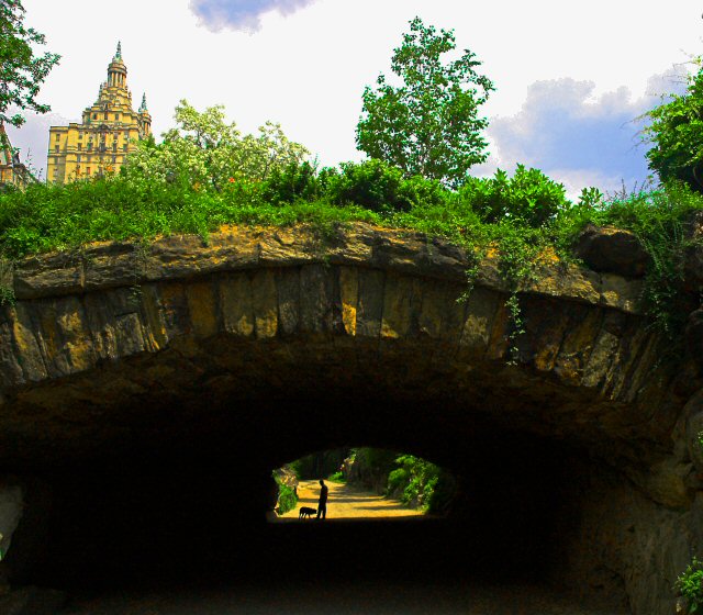
In this image, the eye (mine, at least) is drawn to the building in the upper left-hand corner. The actual framed subject is small, and just doesn't stick out enough.
Your composition allows the subject to be this nice little surprise...I like that you didn't crop out the top portion (that is probably what I would have done)...well done.
As this is an advanced challenge, I would have preferred to have seen some straightening of the buildings and trees at the top. This would then have made a very pleasing image.
The building at top-left is a distraction. You had a subject in the frame (very few photos have that in this challenge) but you spoiled it by including the whole top 30% of the photo... (5)
Always strange to see somewhere you have been many times in a photo from someone else. Great shot! The contrast between the two areas really captures the feeling of being 'right there.'
I think that a tighter crop (leaving out much of the sky and all of the building) would make this a stronger picture. As it stands now, I almost don't know where to look - almost as if the man/dog silhouette were an afterthought rather than the main subject.
oh man, i'm completely blown away by this. I find the sky area and the building a bit too light but I realize we all have different tastes when it comes to editing and that sort of thing. Still absolutely have to give this a 10 and add it to my favorites. This had better ribbon.
This is nice, but I think a little over saturated on color. You seem to have a lot of color noise, especially in the clouds and the leaves of the trees on top.





 Add photograph to your favorites
 Add photographer to your favorites


 Photographer found comment helpful.


