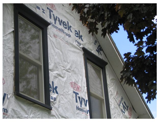
The image to me lacks a focal point. I'm not sure what "the big deal" here is. Yeah, it's wrapped up, but why is that interesting? Perhaps with more contrast and a different color scheme, this would make a better image.
Simple, yet interesting composition. The angle you've used creates nice lines and angles with the window frames and roof edge. The tree in the right adds to the shot IMO. I'm wondering if perhaps at least the left window were not cut off at the top left corner, might be a tad bit stronger presentation?





 Add photograph to your favorites
 Add photographer to your favorites


