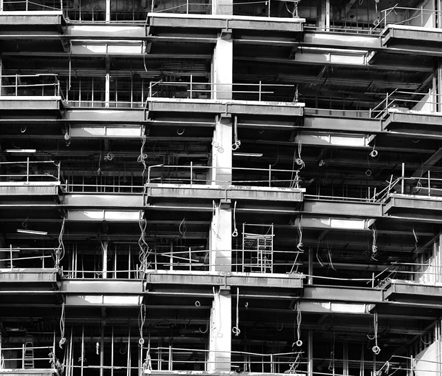
You've found a great repeating pattern here however it's listing to the right. Straightening the 'horizon' so to speak would make this much better. (IMO)
Nice, but the distortion in the lens is kind of ruining this shot for me personally, not of course unless the building itself is all slanty like that but other than that I really like this shot, great composition and the tonal range is very good.
For me this has the potential to be a nice picture but there are a couple of elements that throw off the balance. First off, the horizontal lines are slanted to the right, the main vertical line is skewed and also too much in the center ( it's very imposing) and finally there is no start or end, a tighter top/bottom crop would help this picture... But that just my opinion! What I do like is use of black and white and shadow.







 Add photograph to your favorites
 Add photographer to your favorites


 Photographer found comment helpful.


