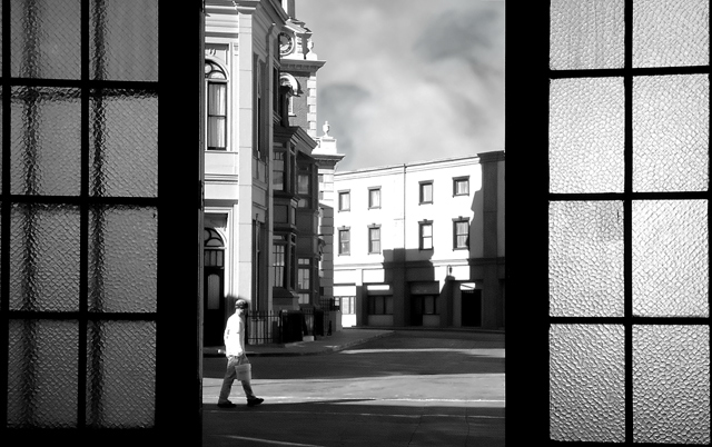
This is one of my favorite pictures from your portfolio. It looks a little too tightly cropped, but the idea is nice and there is some texture that works really well; i.e., the sky vs. the windowpanes. The shadowing is pretty good; and only that guy with the beanie and the bucket ruins the classic feel of teh shot. otherwise, this is a decently artistic shot...
Very nice. Pleasing to the eye. My eye anyway. The windows/doors? are framed perfectly! Any less and the panes would be cut off, any more and they'd overwelm the image. The 'framed' portion is beautiful. Again, the weight of building/street/sky is perfect as well. The 'scene' is SO clean - someone must keep it that way - is that what the guy in the pic's doing???







 Add photograph to your favorites
 Add photographer to your favorites

 Photographer found comment helpful.


