|
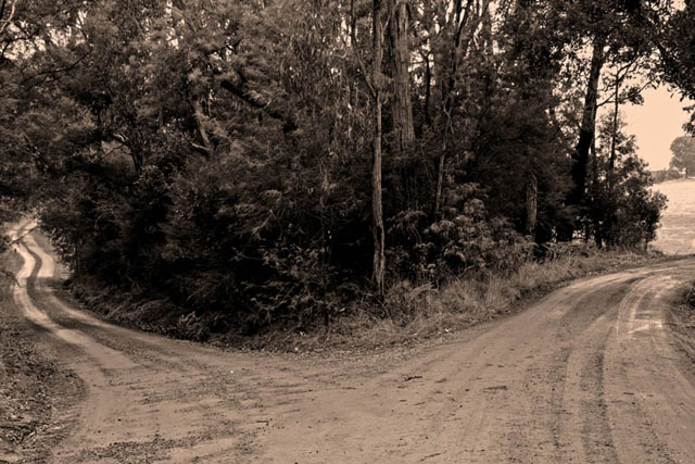
The downward grade of the left path makes this feel tilted, though I don't think it actually is (looking at the far horizon) I like the glimpse of the open space on the right, maybe even a touch more of that would be cool. But it really emphasizes the difference between the two paths. Sepia looks a little pink, but maybe that's just me. Overall, nicely done for the challenge. |






 Add photograph to your favorites
 Add photographer to your favorites


