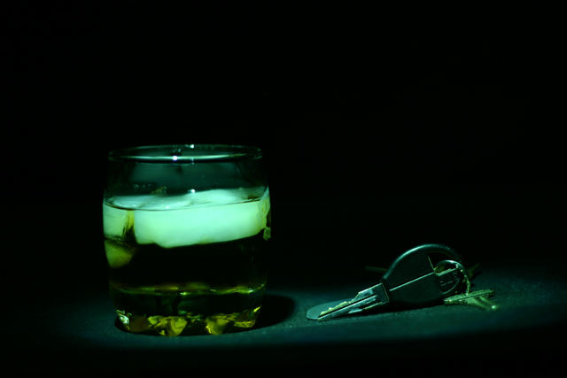
Since we have to use some gauge to vote, I compared this to the other alcohol and keys shots. The tone is very interesting on this one, but I think that the image is too dark and doesn't take up enough space.
well, the message is clear.. I'm not terribly fond of the lighting for this.. Perhaps if the two were parted a little from each other.. and under two seperate little spotlights.. then, i think the concept of 'decision' would be better expressed. The title alone isn't enough..







 Add photograph to your favorites
 Add photographer to your favorites


