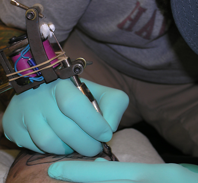
im sure this will score low but oh well. i know there are some shadows and the white on the tattoo machine looks blown out. the vibration of it makes it hard to get the clearest shot. i like this pic and hope you do too!
Statistics
Place: 169 out of 275 Avg (all users): 4.7138 Avg (commenters): 4.6667 Avg (participants): 4.7019 Avg (non-participants): 4.7200 Views since voting: 988 Views during voting: 441 Votes: 304 Comments: 11 Favorites: 0
The decision to have a design painted on you or to pick the particular art is an exceptional concept, however without the knowledge of the challenge woudl I find myself placing a keyword like decision on this image? My answer is no. It is one more on the lines of invoking pain or artistry. The blueish green gloves in fact push me into the realm of safety for the artist for they must be careful nowadays.
I see little in the way of composition that would lead me to return to this image unless it was found in a textbook illustrating the tools or the need for protection in the industry, however there is a subtle balance in the choice of crop and the positioning of elements that indicates a great eye.
Perhaps to better illustrate the decision, the image should have been of the discussion ensuing as the person and artist looked over the many options hanging on the wall or in the book. That image would have invoked a sense of impending thought and a decision to be made on the part of the people the image told the story about. For me unfortunately, I find a weak link to the story of decision in this image and find that compared to the other entries I rate this at a 4.
All the different aspects of this image come together to tell the complete story, which is nice (not a sterile studio shot). Might be cool to have it shot from a little higher up so we could see more of the tattoo-in-progress. The composition (crop?) works really well for this.






 Add photograph to your favorites
 Add photographer to your favorites


 Photographer found comment helpful.


