* Greetings from the Critique Club *
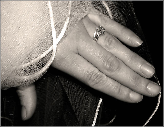
First of all, let me say I remember this image from the Decisions Challenge (fondly). I think you really used B/W to your advantage and the softness and clarity of the image are great. I think you could crop out a little more of the upper left and/or process it a little more (reduce backlighting, play with contrast, etc.) - there seems to be a bit of glare on the fabric there.
The composition is good, but I think could be improved even more by perhaps expanding the crop to the bottom & right. Don't get me wrong - it's a nice rock & should be shown off. I just think that you might accent it more by slightly increasing the size of your crop in that direction.
Very nice shot.
Just my 2 cents...
Jimmy
|






 Add photograph to your favorites
 Add photographer to your favorites

 Photographer found comment helpful.


