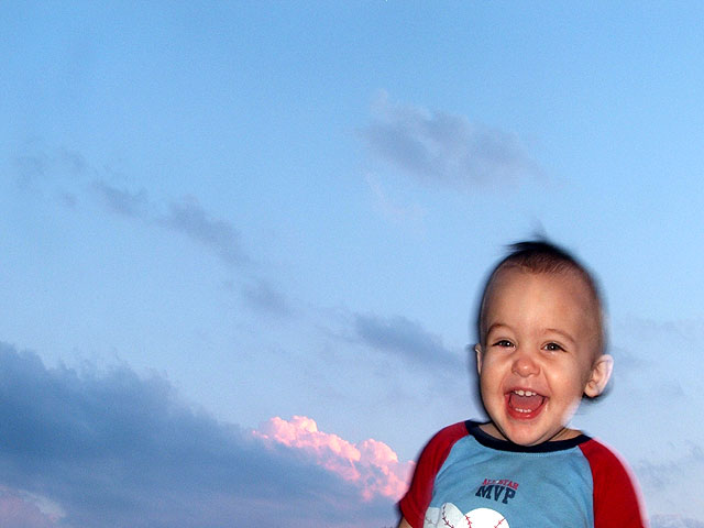
I just had to enter though yes, its another one of my kids... I took some pictures of the sky with nothing in it but the sunset and colors...to boring.. then I added the trees for framing, boring, then I held Casey up to the side and walla this is Beautifull! I like it! The sky is like a painting and by mother nature, babies are a gift and treasure. How can I go wrong...
Statistics
Place: 243 out of 255 Avg (all users): 4.2341 Avg (commenters): 4.1111 Avg (participants): 4.1832 Avg (non-participants): 4.2893 Views since voting: 1039 Views during voting: 401 Votes: 252 Comments: 13 Favorites: 1 (view)
Well now I have to critique myself... John setzler had a thread about this about a month ago..
The white ring edging around my baby's face is not helping the eye any at all. This is a little blurry as well as noisy. There is a shadow as well and perhaps this is because my aperature was set on f2.8...Perhaps if I had openeded it up to about f8 more light could of come through the camera and make this even more sharp. The sun was setting so I used a flash, and one of the worse things about my camera is if I use a filter with my ring adaptor this will cause a circle somewhere on my subject specially if it was a macro...
I got out today and tried some more shots with the similar intensions. They came out far more better then this one did and just a bit too late... So I think I am starting to grasp the skills some....If I was voting though I would of gave this picture a 10 anyways... I love the smile.. hehehe I would though huh.. hes my joy!
Cute subject matter, but the blur on him isn't effective, imho, and there's a "snapshot" feel to this that I feel would not score well with many voters here. The composition feels awkward, and perhaps a crop of the top third of the frame would have yielded a more compelling image.
It is hard to give a lower score to someone's precious child, but in my opinion this photo isn't working for me. The sky is very pretty and the child is very endearing, but the two just don't go together for me. Good luck in the challenge.
Beauty is in the eye of the beholder, and in this image, although I am seeing a fine looking young man, I'm not seeing a fine looking image. The fuzziness around his body doesn't look good at all, and the sky occupies way too much of this image. <3>
Interesting take on the challenge. The blur around the boys head makes it look as if two images were merged. Slightly distracting in an otherwise well composed image.
Little cutie pie! Some reflection on the right..? Window or something but the focus could be a bit stronger.I don't really think this composition is the best it could be. I'm guessing this is taken in front of a screen..? Anyway cute little guy, great smile and he's for sure beautiful.
I'm really not sure how well this fits the challenge, but I keep coming back to it and giggling. I can't really say that *what you shot* is beautiful, you're not *showing* me beauty, but I *do* keep looking at the picture and saying "Boy, that's whacky-but-beautiful!" so I guess it *is* meeting the challenge, eh? Anyway, I like it a whole hell of a lot and hope you do better than i expect you will.






 Add photograph to your favorites
 Add photographer to your favorites

 Photographer found comment helpful.


