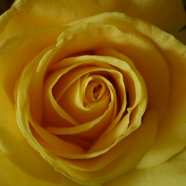
I like the side lighting on this...creates a lot of dimension. Maybe a little fill lighting would brighten everything and really make the yellow shine.
Flowers, in general, always have an inherent beauty to them and this one is no different. I like the choice of the yellow rather than the typical red/pink. The straight-on view is nice, it gives the image some further interest with the detailing of all the folds and turns from the petals. That said, the lighting is a bit off - the lower left hand corner has some nice lighting aspects, but I think the shadowing on the rest of the flower detracts from what you're trying to show. The title "Golden Anniversary" brings to mind a richness of color (due to the gold) and unfortunately the color is a bit dulled in this picture. I think experimenting with different light sources and additional fill lights might help this out! It also looks as if a gaussian blur was applied maybe? I'm not sure if that effect helps the image - I think crisp images when macroesque shots are created are the best bet - this is definitely just my opinion though. I gave a 4.






 Add photograph to your favorites
 Add photographer to your favorites


 Photographer found comment helpful.


