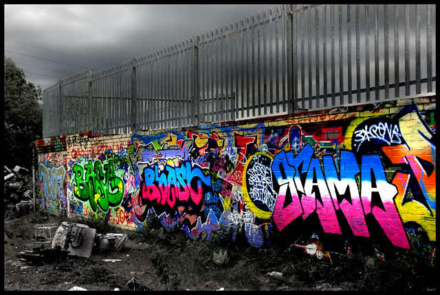
Graffiti on a wall in some wasteland
Levels, saturation, Burnt sky/grass, dodged the wall. added a quick mask to the grass and converted to Mono in channel mixer (90% opacity), cloned out a speck (bird) in the sky, USM, neatimage.
Statistics
Place: 53 out of 255 Avg (all users): 5.9805 Avg (commenters): 8.0909 Avg (participants): 5.8613 Avg (non-participants): 6.1176 Views since voting: 1538 Views during voting: 470 Votes: 256 Comments: 27 Favorites: 3 (view)
First of all, I have to say, WOW!... This certainly has an impactful appeal. I love the use of color & B/W - it really highlights the "graffitti" feel of the image. Exceptionally well done.
The boldness of the color is almost overwhelming - which in this case I think is a good thing. After all, that's what graffitti is all about, right?
I think your use of color vs. B/W is very well conceived. It really adds to the impact of the image's statement.
I'm finding it difficult to say much more about it - other than AWESOME JOB! The clutter in B/W below the color graffitti is great. It's very well cropped and composed. In the appropriate category/challenge theme, I would have scored it a 9-10. (I know that sounds trite, but it's the truth.)
I think you have an extraordinary eye for detail and composition. And I look forward to seeing more of your work!
Challenge: 7 Just not givin me the feeling for beauty.
Composition: 10 The diagonal leading line works very well. The DOF is excellent of this kind of shot.
Technical: 10 The image is very sharp.
Post-Processing: 10 The selective desaturation works very well with this shot. Very impressive.
Creativity: 8 for guts on trying a shot of this nature for this sort of a challenge.
Overall: 9
i wish the title would have been as subtle as the photograph, but i'm not too worried about it. this is great. the colours are so amazing, especially against the lifeless sky behind and grass/garbage in front. the power lines and tree on the left are the only elements that rob from the simplicity of this photo...perhaps you had not other option in this urban environment but to include them. nice work overall, i love it...it really is beautiful! it's great that you saw the beauty there!
Very cool! Not "beautiful" in the usual sense, but I love what you did with the desat to bring out the colors of the graffiti. All I noticed right away was the color, which I'm sure is what you were going for. One of my faves so far! Keep up the good work! :o)
amazing...truly amazing....to recognize this as art and beautiful is one thing...but to do it the honor of sharing it ]and composing it in this fasion is quite another....beautiful job
Talk about vivid. Love the use of desaturation to bring out the colors of the tagging. Focus is wonderful, as is the composition. I think I'd have cropped it right along the line of the wall though, as the tree at the end doesn't seem crucial to the image. The title is a bit bulky though humorous. Very well done and out of the norm. I gave a 7
Bumping up to 9. Love the image, love the colors, love the composition. Absolutely beautiful and unique in the challenge. Wait - make it a 10. Good luck!





 Add photograph to your favorites
 Add photographer to your favorites

 Photographer found comment helpful.


