COMPOSITION
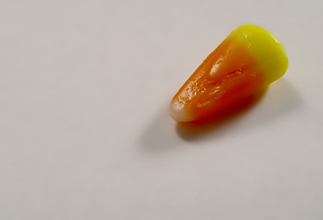
I like the use of negative space here. It really accentuates the candy, and forces the viewers' eyes to it. I think though, that a lower left placement may have made it feel more balanced, at least to me. Right now, it just kinda feels like it is hanging there. Of course, if that is what you were trying for, then you succeeded!
TECHNIQUE
The first two things I noticed was that the background was gray and the candy seemed to be a touch out of focus. maybe the gray could be fixed (if you wanted it more white) with white balance adjustment or by boosting contrast, or by using more light. It may not be so much the background being dark as the site's gray really emphasizing it and making it noticeable.
I do thing a sharper focus on the candy would have made a big difference. The details of it are showing, but it seems a little soft around the edges.
OVERALL EFFECT
I really like your use of negative space. I do think a brighter background and clearer focus would have really made this image *pop.*
Good focus, and interesting composition. I like the concept, but would have preferred to see more light on the candy - possibly enough omni-directional light to get rid of most of the shadows; and boost the contrast a little to try to whiten up the background.
Interesting that you picked one with a lot of surface texture -- I'm guessing some poeple will complain. On my monitor the tip is pretty off-white; I'd have probably made it whiter if I could avoid blowing out the specular highlights.
Simple. This is, indeed, a candy corn. Shown in white isolation like this, it appears lonely and perhaps even rare--odd for the candy that comes in such abundance.
Huge amounts of negative space. Very clear photo with near perfect color. Glare on the candy is a tad sharp, but not horrible. Dual lighting does help to light up most of the subject (two shadows tells me this). Interest - near none, I get no sense of tie-in, no pattern, no deeper message, it's just there. 7 Rob the Swash






 Add photograph to your favorites
 Add photographer to your favorites

 Photographer found comment helpful.


