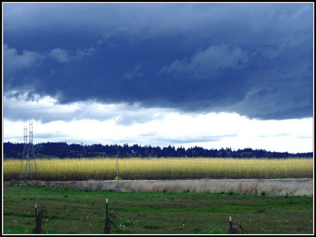
Compositioinally I find the power lines to be distracting. At first, I didn't like the blue you added to the clouds and found it to be unnatural, but after looking at the photo for some time, I don't find it objectionable and think it adds interest to the bands of green and yellow in the pic.
Really nice colors in this photo. Generally though its not very sharp and clear. There's a lot going on here that really doesn't need to be here like fenceposts, powerlines and stuff like that.
The white of your boarder doesn't touch at the bottom corners. The Grass colour is a little dull. The Power lines and the water (is it?) don't go well in this photo.
The only thing I would change about this photo would be the shadowing in the clouds. The white is a little too white, theres not a lot of definition. Still, completely meets the challenges and you have a great eye for colour.
I like the compostion and the way the upper and lower half are balanced. The white area is a touch bright, and has destroyed some detail in those clouds. Not sure how well the "landscape" setting captured this. Most of the photo has a soft focus to it.






 Add photograph to your favorites
 Add photographer to your favorites


