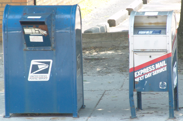
Seems like it's a bit to bright. Some of the colour is washed out, and up in the top, in what looks like a parking lot I'm going to guess it's completly washed out. Good subject though.
I'd say you have met the challenge.
I would like to see a UV filter to help with that bright sunshine. It washes out colors and did so here with the blues/red.
A good concept for a photo. I believe that it could have been improved by exposing it slightly less and/or tweaking the levels so that the shadows are darker.
I am making this comment on a number of votes, but please don't hold that against me: I just wanted to let you know why I gave you a relatively low score in this challenge. I have approached voting with the starting point that the photograph should stand on its own (ie without the title), and have as a focal point a decision (ie I should look at this photo and one of the main things that I should be thinking about when looking at the photo is, "there is a decision just made, being made, or about to be made, and this photo captures that moment". Ideally, I'd love to be provoked by the image into thinking that "the essence of this photo is the decision it portrays".
Unfortunately, absent the title, I would not have guessed that your photo was intended to capture a "decision". As the rules state, I am voting with high regard to the challenge description. However, I am explaining why in case you were left wondering why your score is not doing was well as you expected!
Specific to your picture, I would add that the postboxes are a little underexposed - increasing the contrast and reducing brightness might help. Wonder if you might have been able to find prettier specimens, and perhaps try a few different angels. maybe a model posing to demonstrate a decision more obviously?
out of focus, maybe a different persepective would have worked better, like coming in from the side with your hand out of the window holding a letter. something like that. i usually try to stay away from the bullseye approach





 Add photograph to your favorites
 Add photographer to your favorites


