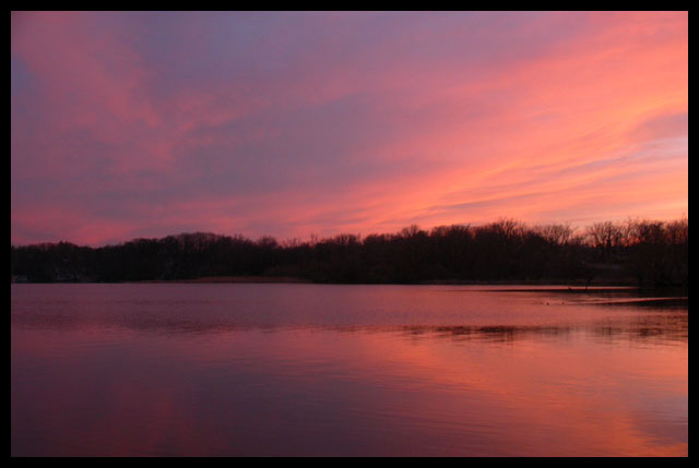
It is a nice enough image but there's something that bothers me about it that i cannot pinpoint exactly. I think it has to do with the fact that everything in the image represents warm colors/tones. Even the trees are a warm, brownish hue. If they had been black there would have been more contrast and a better balance between warm and cold colors. As it is, it gives me a bit of a sugary feeling when i look at it long enough. 7 Journey
Nice title and image. The sky and water are both so beautiful, I can see why you put the horizon right in the middle. However, it might be fun to explore moving it either down or, with this title, up. Lovely and gentle.






 Add photograph to your favorites
 Add photographer to your favorites


 Photographer found comment helpful.


