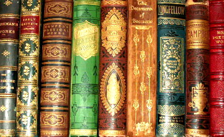
I always enjoy looking at antique books that are over a century old..Not only pleasing my eyes, but also thinking who held them when they were first published..To me, they're beautiful..I resized and added contrast, from the original..
Statistics
Place: 236 out of 255 Avg (all users): 4.4405 Avg (commenters): 5.4444 Avg (participants): 4.3630 Avg (non-participants): 4.5299 Views since voting: 995 Views during voting: 358 Votes: 252 Comments: 10 Favorites: 0
First thing I notice about the photo is the size. It's awefully small. I think that if you took advantage of the allowable 640 pixels we might be able to read the words on the books a bit better and the detail might stand out more. Your photo is only 443x272.
If you didn't find LucidLotus' comment helpful, then I'm not sure how helpful I'll be, since I think they are right on with this photo, but the books DO seem to be leaning to the right a bit. The right 4 books seem to be completely vertical, the all the books on the left have a tilt. That makes it look like a quick shot that was not prepared well.
The colors are neat. I think that the colors not only stand out, but they go nicely together as well.
The light reflections on the books are a distraction. It makes the shot not 'clean'. Some of the reflections are wiping out the details in the books. Some of the little designs on the books are gone and I think that is the beauty that we need to see here. Maybe putting a thin sheet or something between your light source and the books would help reduce those reflections.
I wish I could read thewords on the books. The only actual words I can read are 'longfellow'.
Overall I think it is an original neat idea for the challenge, but maybe a bit more time spent on the image could have improved it greatly.
~Heather~
Nice image, I love books too and these are so colorful. The problem with this image besides the size, is that the gold on the bindings is blown out from the flash. You might try more indirect lighting or using a flash that isn't attached to the camera. Better luck next time.
I love the color. The use of the different colored books was wonderful, and I do find it a beautiful collection. I also like the idea of something different than the usual nature/model image. I think the lighting however is a detriment. You definitely need good lighting to let all these rich colors pop through but the shine/glare that is reflecting off of them is very distracting and does harm the look I think you were going for. I think the focus is decent but could be better - its possible that the glare from the books is affecting this though. Finally, the only other thing I'd suggest changing would be a slight rotation so the books didn't appear to be leaning to the right, rather would be straight up and down. Other than those things I really like this entry and again I love the color shown! I gave a 6.
Great idea- there is so much beauty in books- It would be more pleasing with more depth of shadow- Too much light takes away from the dark richness of the covers.





 Add photograph to your favorites
 Add photographer to your favorites

 Photographer found comment helpful.


