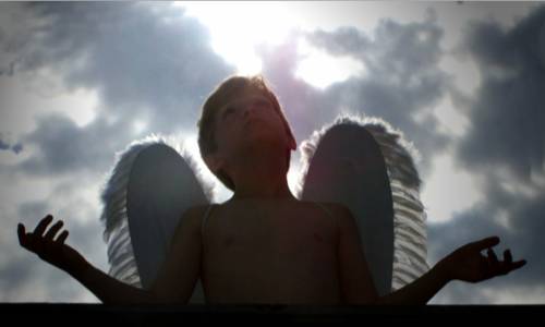
Go ahead and make the image as large as the site will let you!! It lets us see more detail when we're voting :-) I like the composition of this image quite a bit. The lighting is almost either too bright or not enough. The subject looks pretty dark (dark enough to obscure detail) but not so dark as to really make a sillhouette. Really like the creativity :-)
The concept for this image is great. But a good backlight image is hard to pull off. In this case your sky is overexposed and you need more light on your angel's face. A strong sidelight shinning down on your subject's face and arms would give him a more angelic look as well as add much more interest to the composition. Under better lighting you would also need to clone out the angel wing straps. The general clarity of the image is not particularly good and would need to be improved.





 Add photograph to your favorites
 Add photographer to your favorites


 Photographer found comment helpful.


