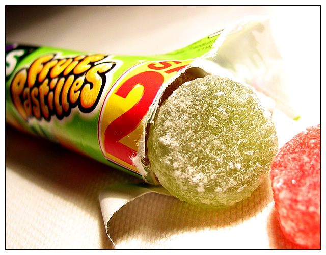
You've made these look good with dramatic lighting and interesting angles. Your point of view helps, too. The candy itself may be slightly overexposed, but this is a fine photo.
The green candy is very sharp. Good color. The angle makes adds interest, but less great as an "ad" copy (companies want their product name easily read). The backgrond looks like a paper towel (eh, not really great) and in the upper right corner is way blown. 7 Rob the Swash
good crispness. white balance is too orange. maybe use a silk cloth or something instead of a napkin -- napkin takes away from the pro advertising feel :)
I have looked at every single photo here -- I'm a complete candy NUT, but for some reason this photo was the only one that actually made me hungry for candy. There's something so inviting about the composition! I think I'll hit the grocery store tonight. Gee, thanks. :)






 Add photograph to your favorites
 Add photographer to your favorites


 Photographer found comment helpful.


