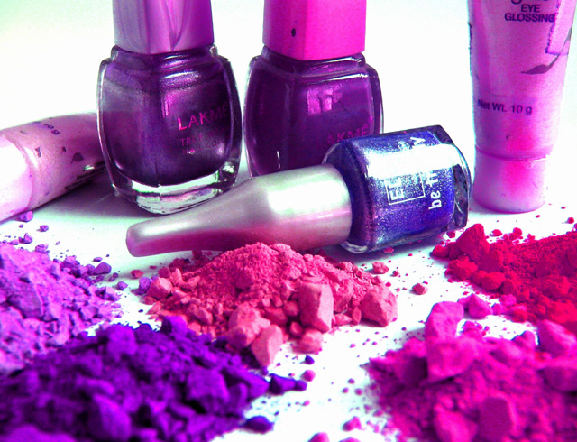
I liked the colors and composition. Should have placed higher than it did. I think the voters penalized you for the unfocused foreground. Keep up the good work.
This is a pretty neat shot and could seriously have been used in an advertising challenge. My only beefs are the foreground is *too* out of focus and there's a lot of glare off the bottle on it's side.
The glare on the center bottle is a little distracting and a few of the other bottles could have been wiped off. I really would have liked to see more silver bottles so not everything is pink-purple. Then again, is the powder just reflecting? That is just a personal thought, that maybe if the bottle's tops and the tubes were silvery, they would stand out but not take away from the sight of the powder. I really like the image overall, though.






 Add photograph to your favorites
 Add photographer to your favorites


 Photographer found comment helpful.


