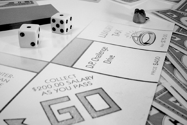
I knew that we were bound to see the king of boardgames here in a couple of shots and yours is very good. Like the use of black and white here, nice arrangment of the elements. A little washed out up top but sinces there are no importan elemtns there it doesnt hurt the shot or my vote.
I like monopoly and I like it even better in color.. Did you intentionally fade the printout on this photo? The 'community chest' cards behind the dice are actually bothering me just a bit because of the sharp dark contrrast that they introduce into the fading background. Bringing the GO into a little sharper focus could be an improvement as well.... good layout and nice effort on this photo...
he he ... DP Challenge - the most expensive on the board - are we playing the rules that if your roll a double you don't have to pay? :) The B&W doesn't really do it for me on this photo. Also would have liked to have seen the properties past 'Luxury Tax'. The blankness is very apparent to me. Dice and money on the side are good, but I don't think the bits at the top were required
I think if you'd used matte paper, the reflections of the dice and the metal piece wouldn't show so much. It's kind of strange hoe the image drops off toward the back, it looks like the game doesn't continue...
maybe it's just me, but i dont like seeing "DP Challenge" in the photos. It almost seems like you're trying to get brownie points. personally i think it detracts from the photo and it feels like pandering.






 Add photograph to your favorites
 Add photographer to your favorites


