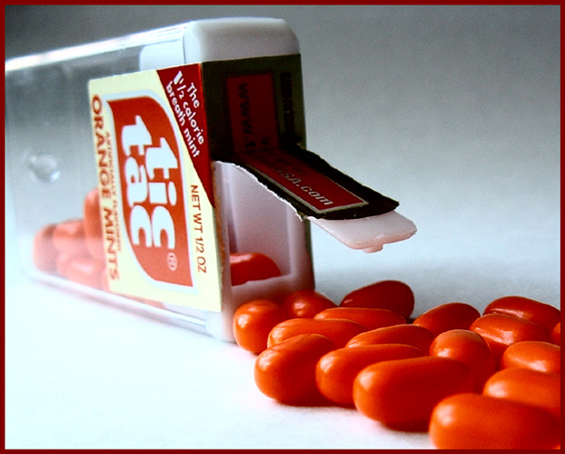
This looks a bit like an advertisement. It's pretty well done, but you might want to try opposing lighting (so the lid isn't silhouetted) and a tad softer lighting (looks like the same window I used...) 7 Rob the Swash
The focus and lighting works well here, but after looking at it on three different monitors, the orange tictacs look almost like the cinnamon ones. I would almost bet that you have a Sony camera, because both of my Sony's do the same thing(reds and oranges are crazy sometimes). Maybe the green ones would have done better. having said all that, the composition is right on, and I really like this shot.
Those "orange" mints (I've never understood what that is exactly) look more like roma tomatoes with a spit shine. Good framing and I like the dumping out effect.
Great layout but I wish I could see the back of the tic tac container. Also - it's a bit bright for my eyes in the llc - perhaps a different color bg would have even made a difference. :)






 Add photograph to your favorites
 Add photographer to your favorites


 Photographer found comment helpful.


