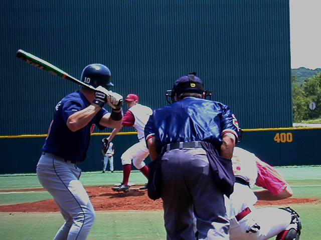
Seems too dark / over-exposed at the same time. A lot of work on your lighting needs to be done. It looks like you over-exposed it in the camera and tried to darken it afterwards. You should've tried to retake the shot.
this could have been cropped tighter so the far background beyond the wall didn't show and tilted so the wall line is level. Still a very good picture.
the contrast seems a bit off in this photo. also, this probably should have been rotated clockwise and cropped before submission. it's a good idea and i think if you had taken a lot of photos, you might have found one that worked a little better.
I like this shot overall, but there are 2 distractions in it for me, first of all the color is not that good, I tried to fix it in photoshop but it was still too contrasty, second and this will sound strange but it would keep this picture from being published in a newspaper or magazine without airbrushing it out, that buldge in the front of the batters pants has to go.
This is a well timed shot, but the colors seem very strange. I thnk it needs some levels work in an editing program. The horison line is also a little crooked -- I'd suggest rotating it slightly clockwise.
You get 1 extra point for being brave enough to stand where you did to take this picture. Its too bad the real world creeped in on the upper right. This shot would have been a lot better without that.
Nice. There weren't too many sport shots (and I'm guilty of not submitting one, too), so this makes a nice change. I like the framing, too. A couple of things to consider next time are that the photo doesn't seem to be quite level, and (if that was possible) to move a little further to the right so that the whole background is the screen, and not the stopsign and trees poking through on the right. That would've also given you a slightly more sideways view of the player in the front of the photo.
My first guess is going to be that you are on a mac because this picture looks a bit dark on my pc. Once its brightened and you add a little contrast it looks great. You have great DOF, but I'm not sure if I like the angle. its definitely different.
Nice action capture! I know this was impossible from your perspective, but the shot would be really great if the pitcher was more in view between the umpire and the batter... = 8
great position for this shot. Slightly tilted. I did a quick rotate and crop, leaving the top of the bat in the left corner, and took out the 400 sign (yeah that cuts off the catcher a bit, but he's not really that important to the photo). IMO it seemed to make a better composition.






 Add photograph to your favorites
 Add photographer to your favorites


