Author Thread
Post actions
Ken, that's a pretty good idea.
Comments Made During the Challenge
Post actions
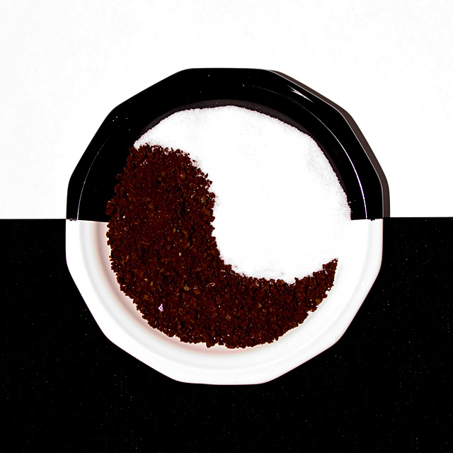
great concept! the details in the sugar are somewhat lost in all that white, perhaps a more coarse sugar would have more visual impact. nice work!
Post actions
Sugar is a tad burned out on my monitor at least. Nice comp though.
Post actions
amazing picture. I like the idea. the focus is good and the levels are perfect. meets the challenge well.
Post actions
This ones worth framing..good job
Post actions
i like the symmetrical balance
Post actions
Great idea! Technically very sound too. I just wonder if it would be more effective rotated 90 degrees?
Post actions
Really nice idea, especially the b&w bowl, but I think your contrast could have been better - both the coffee and sugar don't really look as granular as they could.
Post actions
Nice styling, is it a hair overlit? So we could see the grains of the salt/sugar? Maybe that's not possible.
Post actions
pity about the specks on the black background and the annoying sugar granule in the coffee also you lose points on originality - its been doen before sorry 5
Post actions
Neat concept, but I feel like the white is taking over everything.
Post actions
Mmmm, sugar and coffee in perfect ballance, very good idea and well performed.
Post actions
Post actions
fab idea! love it. a lovely well thought out picture...
Post actions
Very cool - looks like lots of work. Photo could be improved by removing specs from black background and eliminating the shadow on the right of the plate.
Post actions
Post actions
8 for design 1 for creativity
Post actions
Nice composition, image looks to be a bit noisy in top white area
Post actions
dizzam this is cool... just which the black was solid. so many little white specks in the black. also wouldve been nicer if the black paint on the plate wasn't as messy around the inside edge. other then that, i really like this.
Post actions
I would have shot this in black and white..








 Add photograph to your favorites
 Add photographer to your favorites

 Photographer found comment helpful.


