this was the first of about 80 images that i grabbed as faves when i discovered the galleries. i am still blown away by the depth and quality of images found there--this is just a great example of that.
what i was looking for were examples of images that were basically flawless in the execution to the extent that i would have have the following reactions:
"wow"
"that is really cool"
"damn, i would like to try that"
"they make it look so simple"
when i was growing up, my dad taught me that the best haircut is one where nobody can tell you had a haircut. as with anything, the best work is that where you immediately appreciate the end result, and that you only notice details (and/or flaws) later. this image is one of those. expertly envisioned and captured, well worthy of emulation. and, one of these days, i'll take a crack at it ;-)
Hello from the Critique Club- Your picture has just been freed from my hostage pile.
I don't need to tell you this is a wonderful photo! It has a little red ribbon to prove it. And you got a great selection of comments that reads like a who's who of DPC.
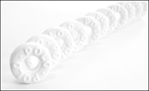
I can review this photo by summarizing the comments. For your technical work you got high scores. Your focus is right on. Your lighting is exquisite, a soft cool light from the opposite direction from the movement of the composition. Some people thought you need just a bit more contrast in the shadows, I think not. And the thin black border works to define and compliment the high key image, especially important on DPC where the background is a neutral grey .
As for composition you have included quite a lot of the classic compositional elements for such a simple picture. I like the merging of background and foreground. I like the repetative rhythm, and that it creates a sense of motion, the Polos seem to be rolling. The color, or lack of it, is subtle, this is not a black and white image, it is a white and white image. The strong leading line bends slightly and leads from front to back, left to right. An image that reads left to right is considered to be dynamic (contributes to the sensation that the mints are rolling) while one that reads right to left is more static. Your line is composed of rolling circles so the viewers eye rolls back into the picture for another and another look. If you can lure the viewer back into the scene, the image gets the attention it deserves. You have created a perspective - the circles diminishing is size on into infinity. The line of candy divides the image into two areas of negative space unequal in size but balanced visually because the larger (more weight0 on is on the bottom.
An effecive photograph is a simple one. The simpler the image, the stronger the statement. Also I think you cleaned up the votes for originality. The white on white is stunning and especially so when the theme of candy conjures up color to most people. It feels to me like this picture is an exension of your astronomy and moon shots, turning the scientific into art.
I have to say, though, that my favorite picture of yours was the portrait of two kids, a long time ago.
I am one of the evil hostage holders. this image was asigned to me by the CC computer. I will get to it eventually, I always do - I need to think about it a bit first.
Really nice ! This looks well thought out and well executed. The composition is great, and the negative space really makes the shot work. ( I think that your shot may suffer in the ratings because of lack of color, but if so, I wouldn't let it bother me - this shot is wonderful.)
Subtle, subtle, subtle, and striking in its subtlety (if that makes any sense). The white on white really shows off your mastery at lighting. My only suggestion would be that the POLO words are not lined up. But a minor thing with this masterful photo. My favorite this week. 10
This is a very nice high key shot! One thing I would have maybe done a little differently would have been to take a lower point of view and fill more of the frame with the mints. You've got a little too much negative space at opposite corners. 7
Darn cools shot! Nice use of white on white! Clearity is very good. Nice arrangement. In fact, this impresses me to the extent of raising it's score from 8 to 9. Rob the Swash
I like the title and idea. Nice clean soft shot. (Personal critque: Would have been very cool to have somehow made the mints vanish into the picture - maybe by purposely buring them out at the back via over-exposure).
very cool (what's a polo?). is this a line-up of a bunch of these things, or one rolling (my first impression). either way, great shot! perhaps too over exposed (something i've suffered from a few times - at least from a voting perspective), but then again, i like it. good luck.






 A hint of mint
 Add photograph to your favorites
 Add photographer to your favorites

 Photographer found comment helpful.


