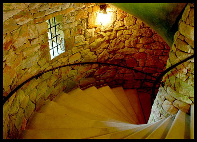
Taken at the DPC Philly/Longwood Gardens GTG. Adjustments: Levels, border added, resized, unsharp mask. The colors were already there, I just emphasized them slightly with the levels sliders. I'll post my outtake after the challenge is over - I like it better, but it would've been hammered in this challenge. This shot is handheld at 1/1.6 second and is somehow not blurry.
Full Exif:
Nikon D70
2005/05/22 12:32:14.8
JPEG (8-bit) Fine
Image Size: Large (3008 x 2000)
Lens: 18-70mm F/3.5-4.5 G
Focal Length: 18mm
Exposure Mode: Aperture Priority
Metering Mode: Multi-Pattern
1/1.6 sec - F/5.6
Exposure Comp.: 0 EV
Sensitivity: ISO 250
Optimize Image: Custom
White Balance: Auto -2
AF Mode: AF-S
Flash Sync Mode: Not Attached
Color Mode: Mode IIIa (sRGB)
Tone Comp: User-Defined Custom Curve
Hue Adjustment: 0°
Saturation: Enhanced
Sharpening: Medium high
Image Comment: c.Benjamin Snyder 2005
Noise Reduction: OFF
Statistics
Place: 54 out of 239 Avg (all users): 5.8976 Avg (commenters): 6.4615 Avg (participants): 5.6796 Avg (non-participants): 6.1176 Views since voting: 877 Views during voting: 329 Votes: 205 Comments: 15 Favorites: 2 (view)
Hmm. While I think this is interesting, it isn't really drawing me in and holding my interest at all. I saw the decent score and thought maybe I was missing something, so I look harder and I am not sure why, but the shot just isn't very appealing to me.
The only thing the lighting really adds to the photo (other than light obviously) is that it makes the stairs darker as they go down, but even that is very slight and not really a major effect.
The color seems odd as well. Lots of orange-ish yellow. While I realize that this may be the actual color, it gives it the appearance that the white balance is off.
Focus is good for the conditions you stated. The stairs seem slightly soft, but the far wall seems nicely in focus.
The blown out light on the wall doesn't add to the photo, and I think creates a distraction even.
I like the scene you captured. I think it's interesting and definately not something I personally see everyday, but still, I'm not drawn into the photo. I hope this isn't harsh, I just can't connect with this shot.
~Heather~
Wow, I really like this a lot. It kind of makes my stomach clench up with nervousness. Great lighting, form, texture and composition. A most compelling shot that makes you want to know the story with this.
I like the lighting and great angle you chose for this. The colors and detail are quite nice. Like the sunlight showing opposite the window, amazing how it overpowers the electric light....that's a bit of problem, only nit is the overexposed light fixture on the wall....metering on it might have made everything else, except the window and the sunlight on the right, much darker, but the lighting might have stood out better and you might have gotten some rays shooting across...unless they were canceled out by the electric light....Have to try it some time. Good Luck!
The composition is very interesting. I especially like the corner of green showing at the top and the light in the window. Not sure about the inclusion of the actual light on the wall, but interesting.
great composition, love the curves and the contrast between the smooth steps and the rough bricks. I would have loved for more to be made of the light coming from the window and falling on the steps
In my opinion, the problem here is that you have two different kinds of lighting... one is from natural light, the other from tungsten, resulting in a confusion of color. The stairs, the walls and the railing all make for interesting textures, so I'll give you credit there. Good luck in the challenge!
Very visually appealing, with the rich colors and textures. Indeed the light makes this picture. And of course, the Nautilus composition is excellent too.







 Add photograph to your favorites
 Add photographer to your favorites

 Photographer found comment helpful.


