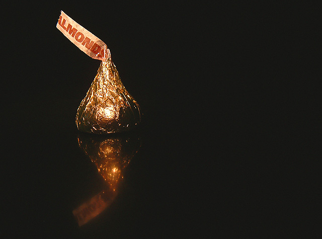
I'm not a big fan of Hershey's kisses, but you did manage to pick the one that I like best for your photo :) I really like the negative space and the reflection you used here. The background is flawless (nothing to distract), and so is the focus on the photo overall. The reflection from your lightsource on the kiss is a little stronger than I would like (you could fix that with some tissue paper between the light source and your subject and extended exposure time). I wonder what this would like with the little almond tag to the right (or alternatively with the negative space to the left of the kiss). At the moment, my eye wanders up that flag and follows its direction straight out of the picture.
All of these are smaller things though, overall, I like the very simple, almost elegant approach you took for the photo, which is underscored by you picking a golden-brown kiss rather than one of the more brightly colored ones. Definitely meets the challenge, and, based on the score, was well received. And deservedly so.
Just read through the comments, I think DennisF nailed it with the negative space. Since your background is so nice and evenly black, try cropping the right side and then extending your canvas (set it to black) to the left. See if you like it :)
Please let me know if you have any questions or comments about this review.
Looks like a candy ad! Nice use of rule of thirds. Well set up (almond flag!). I see why you used direct lighting (face on), for the good, well aligned reflection, but it does leave some of this little candy "in the dark", no ideas how one might improve that. 8 Rob the Swash
I'm going to have to try a mirror shot - they are neat. Had the candy been in the right third, my eye would have swept to it (in a reading motion); composed this way, I come to the candy immediately and the empty space is wasted. Good shot.





 Add photograph to your favorites
 Add photographer to your favorites

 Photographer found comment helpful.


