Initial Impression:
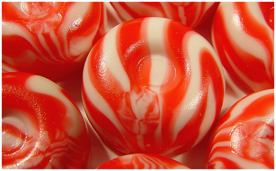
Orangish, interesting patterns and textures.
Challenge:
It meets the challenge well.
Composition:
Sound, if just a bit uninspiring. I'm not really sure how it could be made better though..
Technical:
As I mentioned in my initial impressions, this is just a bit too orange. It diminishes the impact of the candy ever so slightly and makes it a bit unappetizing to me. I really like the lighting.. it's well done and shows off the texture of the candies nicely. Good Job!
Overall:
I like this photo, it shows off the candy in an appealing manner. Good job!
Your picture makes me want to reach into the puter and just grab it and eat it. This looks soooo good. Your lighting, composition and colours are just awesome. Very well done and GL in this weeks challenge.
Very nicely done. The glare is pretty soft. focus is very strong. Color seems pretty true. Cropping - personal choice. Overall, this is pretty good. 8 Rob the Swash
The funny thing is that I am eating these exact sweets as I comment! That must be worth an extra point :-) Choice shot, very sharp and in focus. Nothing to criticize about it really. Awesome!
Good color and texture to this photo. The orange cream savers are better though but I'm sure have a little less visual impact as the strawberry ones. Nice job





 Add photograph to your favorites
 Add photographer to your favorites

 Photographer found comment helpful.


