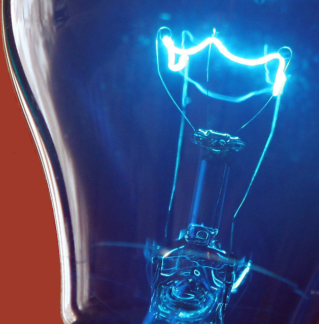
Well, I thought the background color looked really neat with the blue of the bulb. I see you got a couple comments saying that it was a bad choice. *shrug* I like it.
Your focus and clarity here are simply awesome. Really nice detail in the bulb. Something we normally wouldn't see or notice had you not taken the time to photograph it.
I like the way the 'lighting' shows up as a bright area, but I'm wondering if that could be toned down slightly. As it is, it just seems a tad too bright. Maybe it's cause it's blown out, and I can't say for sure that if it WERE toned down, that it would work. I guess it's something I'd have to see to decide. It just seems a little off, but I can't really say how to fix it.
I love the angle and framing you chose. The curve of the bulb looks really neat with the background behind it like that at that angle. I also like that it appears that the background is showing through the blue a bit and creating a bit of a purple area.
This is a really neat image and I think that it really doesn't require any improvement what so ever. In my opinion, this should have scored higher. Congrats on a great image.
~Heather~
I like the idea and the colors. Might be better as more of an abstract by cutting off the red area on the left or by leaving the red area in and shifting your camera to the left to have more of a diagonal split between the light and the background.
In many ways a "perfect" photograph, expecially for this challenge. Love the upper left corner framing. But I keep wonderign why you chose that starange BG color? It creates a sort of "contrast pull" that draws our eye away from what we should be looking at.
I really enjoy your idea here. The composition is excellent and the subject is interesting as well. I'm a little disturbed by the choice of background color. The red creates too much of a contrast pull from your subject area and points of interest...





 Add photograph to your favorites
 Add photographer to your favorites


 Photographer found comment helpful.


