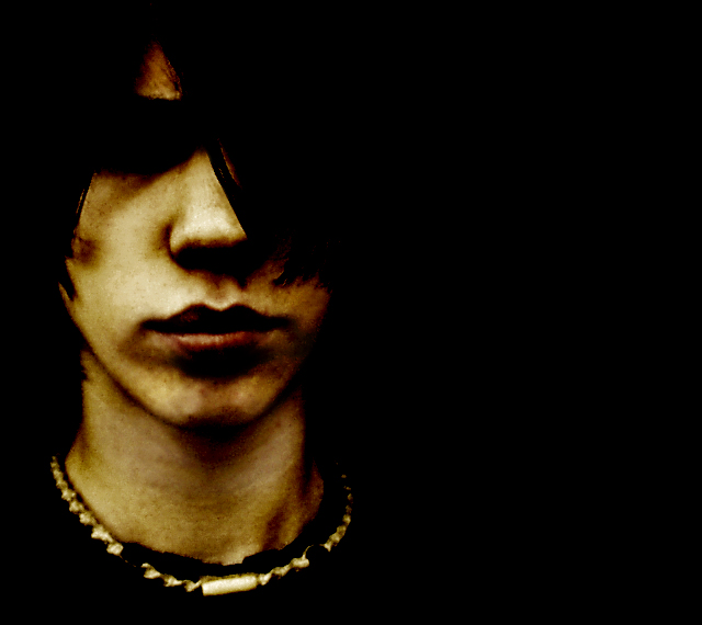
Great portrait....But...would very much liked to have seen the one eye not covered by the hair. Lighting is quite fine and I like the mood and negative space.
Very impressive !! I can almost smell the teen spirit. What is of particular interest is the darken eye surround where no sign of the eye can be seen...... Umm this really gives the image a certain defiant nature which adds much intrigue.
An interesting concept here. I'm afraid a lot of the voters here may look at it as "over processed", but I kind of like the effect. I like the composition, and a definite 'mood' is present. I'm thinking though, that I wish you could see the eye that is not covered by hair. I think that that might make a stronger emotional connection.
thanks for being a member here. always a pleasure to see your work. Great shapes in this. the contrasting triange of the hair over the eye (which reminds me of a clockwork orange posters) and the circle of the necklace...great stuff.
That negative space... you just have it there!
The extremes make it fit the challenge so well IMO.
The light, the tones, your wonderful process. Simply a good photo!
As always...
"Use lighting in a creative fashion"...check...+ some PS and you get this bit of creativity... Love the gloom, the "mystery"...thanks for not being "typical" and "pretty"...great strong graphic quality about this image, really nicely done.
I'm in love with this one. I suspect it won't do well, because it's gritty and "ugly" and the eye area is just a black hole, but I htink it's a compelling image and I'm placing it right on top.
I like how the light works on the subject the rest of the darkness is not bad. There seems to be a touch of noisein the lower right of the mouth. On the parts that are light there seems to be over saturation. 7





 Add photograph to your favorites
 Add photographer to your favorites

 Photographer found comment helpful.


