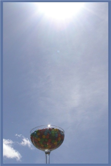
huh. Can't say I like this one. Too much sun creating a virtual washout of the candy. I find it hard to look at, with the sun so prominent in the picture. Adjust the exposure, or the angle of the image... This is a tough one to critique. One interesting optical "illusion" here is if you scroll down, until only the candy is showing, it is much clearer than with the entire picture in place. I did look at the rest of your portfolio, and am very impressed, so I think this just seems rushed.
I like the negative space concept. For me, there is not nearly enough light on the candy - it's so dark that it's barely noticeable. Not crazy about the border- not enough contrast in color, and I don't like the light blue line on just the top and the left side.
Cool idea! Very different/creative. To me, it seems like there's too much negative space between the candy and the sun. I am impressed with the nearly complete lack of solar flares (I find only one, my lens creates several if I get even close to the sun) I'd also like the candy bowl just a little larger in the frame. 7 Rob the Swash
nice idea. i think the candy should have been focused on and should be brighter, because the sun takes precedence over the picture. i like the sunspot in the glass. too bad the cloud wasn't a little more centered.






 Add photograph to your favorites
 Add photographer to your favorites

 Photographer found comment helpful.


