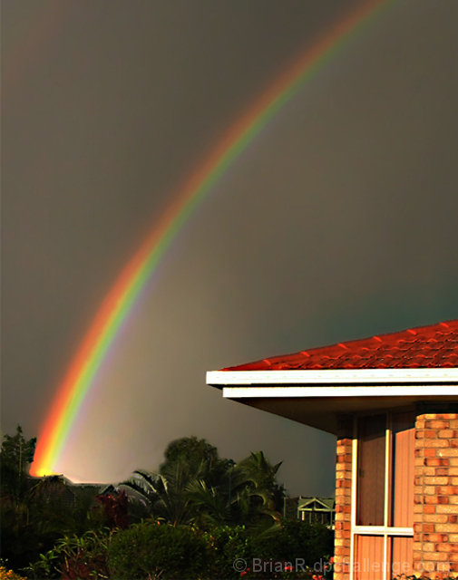
Very beautiful light indeed. Striking colors too. Somehow, though, there is not one strong subject for the eye to settle on. The strongest part of the rainbow is at the lower end, where it's offset by the brightly lit house, which leads somehow to a sense of imbalance... of course, you couldn't have possibly moved either around :). Nice job, and great light!
Always a good subject for light, but the composition here could be improved imho. My eyes are drawn to the roof of the house for its sharp edges and bright red. It competes with the rainbow for attention. Also, the post processing looks a little rushed. There is a clear and noticeable line separating the trees from the sky. To me it looks like either a little too much use of the clone tool or a composite image. The rainbow in itself is good, but I think the rest of the image really needs work. A softer background/foreground would better compliment the rainbow in my opinion.
The thumbnail to this one jumped at out me almost immediately, The larger image is very nice as well, though taking a closer look at it, something about the bottom of the rainbow does not look natural, the lines around the trees seem very odd, can't quite put my finger on it....






 Add photograph to your favorites
 Add photographer to your favorites


 Photographer found comment helpful.


