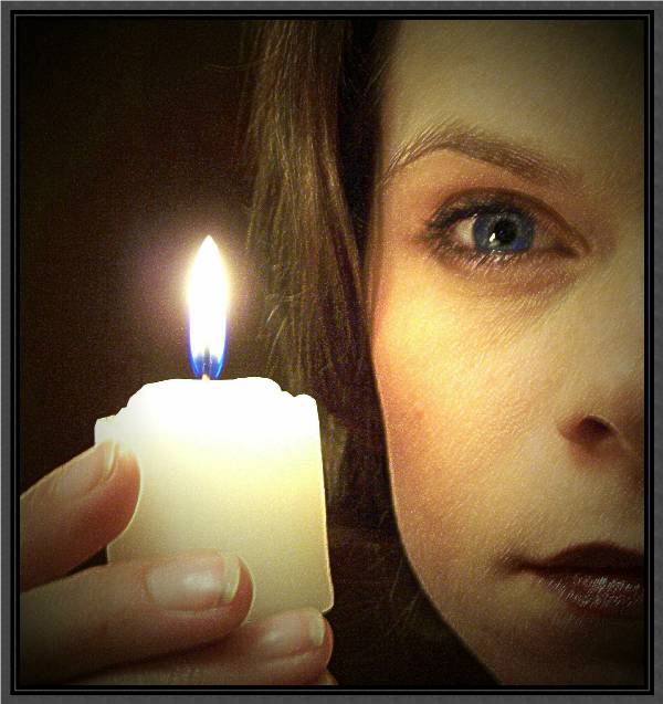
I like the noise and blur, it gives it the effect of moving around and searching for something as the title suggests. It alss gives it that old aesthetic quality of an 'old photograph' as you said.
hbunch7187, your comments were very helpful. The reason why I did not click that some comments were helpful wasn't because they were negative, it was because I made the picture grainy on purpose. I really like the effect. I did have a little bit of a blur in some areas of the original photo because I was holding the camera with one hand and taking a picture of my refection in the mirror. My hand kept shaking! That is also why only have of my face is showing! I cropped out my camera!
I see you don't think of the 'negative' comments as helpful, so I'm not sure I'll be of much help either, since I tend to point out areas where I feel the photo needs improvement in my opinion, but I'll try.
The very first thing I notice about the photo is the grain/noise, as others have pointed out. This may have been YOUR intent or preference, however, I would prefer to see this clearly. What exactly is the main focus? The candle? The face? The eyes? I would think it would be the eyes since even the title suggest that the girl is looking for something. The face is covered with enough grain that it looks out of focus. See the eyelashes? They are almost nonexistant, since they all seem to blurr together and we can't see any seperation of eye lashes at all.
The edges of the candle appear blurry due to the grain interrupting a smooth line.
My eyes move around not focusing on anything, just looking for anything in focus enough for my eyes to rest on. I think having even just one thing to focus on would have been a great improvement.
I like the set up very much. I think that it is a very good comp and the model is attractive and I like the closeness of the candle.
I just wish I could see more detail in the photo.
Lighting definately is an important part in this challenge, and you have mastered lighting with this photo. The lighting would BE the photo.
I think that by the low score, it appears that most people would probably have preffered this without the grain.
What is important though, is what YOU prefer it, and comments are nothing more than a way of telling what would 'appeal to the masses'. If you are putting these in a personal album, then who cares what everyone else says, however, if you are wanting to sell your photos, it is usually a good idea to take into consideration the majority opinion.
~Heather~
Great idea, excellent composition and lighting, but the motion blur and over-sharpening ruins it for me (and the overkill frame doesn't help either). I'd suggest you reshoot this until you get a tack-sharp one, you are very close to a superb photo here.
Great idea. I'm scoring it a 7. The contrast seems to be a bit too sharp for my taste. A couple of the model's fingernails are dirty, perhaps a manicure would have helped. Her face is slightly out of focus. Perhaps a lighter border/frame would have helped.
Looks like a bit of motion blur here. In combination with the noise from the relatively low light, for me it really detracts from a really nice set up and lovely model.







 Add photograph to your favorites
 Add photographer to your favorites

 Photographer found comment helpful.


