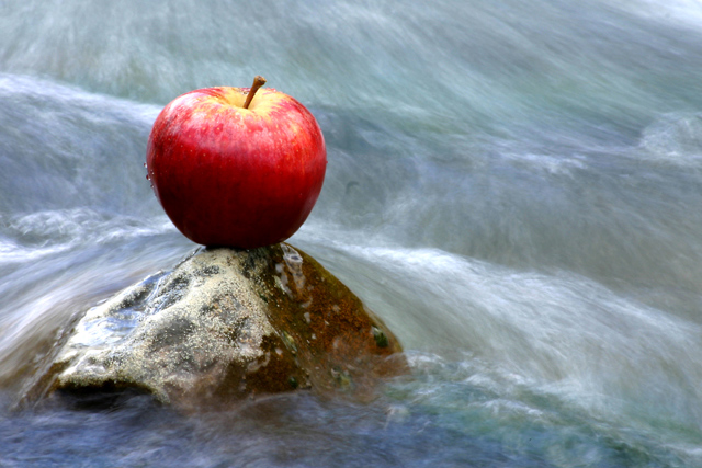
I loved this image except the color of the apple! I would have gone with green or solid red like this - the yellow changes the balance of hues. Gorgeous water editing. 8
I scored this one a 10 because (1) it obviously meets the challenge with great focus on the subject, (2) I like the lighting, (3) I like the color and motion blurr of the water. You picked up hints of pastels. Bonus: I like how you caught the water drops on the side of the apple.
For my personal taste this is too bright and not nearly as mysterious if you would have been if you had used a couple of stops less light, either in aperture or faster shutter speed. Anyway, nice Idea but doesn´t quite hit the spot with me.
I am leaving a comment for everyone so no one will feel left out so here is yours...
it's okay but I get the feeling you could put an apple anywhere and take a picture of it ;)
Nice idea. The stucture of the rock seems a bit unclear. Is it unsharp because of water flowing over or is it a small DOF, it draws my attention away from the apple. Valid, criticism? I don't know myself.





 Add photograph to your favorites
 Add photographer to your favorites


 Photographer found comment helpful.


