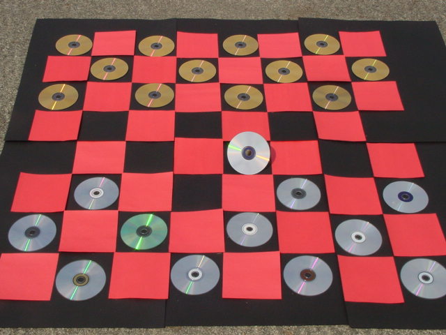
Thanks for the comments. The "rug" is actually driveway cement, the board was 44"x44" (to accommodate the CDs). My favorite photo editing software (CPIC, shareware) doesn't output images sized to agree with this site. It says it's 640x480, but the site keeps rejecting my shots. Future submits will be cropped, or I'll die trying. The CD tilted in the center was to "add interest" (my aim).
I would have cropped a little tighter to get just the checkerboard in the frame. The carpet around the edges is distracting. Great use for all those old CDs!
There is nothing on the image to really excite me. The subject is pretty flat with no texture except for the rug, which should have been cropped out, so its hard to make it look good. What might have worked is standing up the CD's using some sort of base for each and then getting a lower angle.
I like your concept with this photo... I believe that a little extra symmetry overall in this image would be a nice improvement. Your 'board' is is also not oriented properly... red or white square is always in the lower right (this doesn't affect this particular photo). However, rotating 90 degrees clockwise would allow you to have the larger black side of this board cropped out, which would add some more symmetry along with proper centring in the frame... good job!
Pressed vs. Burned! Should have been a bit neater with the black edges of the paper -- maybe tape em together? And definitely should have trimmed the black edge on the right... All that time to cut out the squares and you didn't trim the right side to make the entire "board" square? yuck! Composition/cropping needs some work too.






 Add photograph to your favorites
 Add photographer to your favorites


 Photographer found comment helpful.


