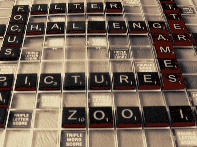
Are these old game tiles that are loosing their color or is this something funky from the compression? Can't make up my mind. In any case, nice setup, the focus should've been more in the front of the shot, IMO.
I think I like this....I'm not sure what it is exactly that appeals to me...and that's not a put down, it's just that it's B&W and.....I'm really not sure what you did to it. It makes it look really old and it's better than having those board colors come through. I think it was a good thing that the color is gone from this....less distracting.
The phooto is a bit out of focus and I am not sure what effect you were using with the shot to produce the posturized shadows of the pieces. I think if you took a couple more shots of this you would of gotten better framing of the shot and the words would all been completely in the shot. You could of also tried various lighting sources for this shot.
I love the color on this, but wish it was a little sharper and less hot spots. The blanks draw my attention - I keep wanting to look at the 'empty space'. But the coloring is really nice. good job.
What happened to these tiles on the right? Are they just worn out? The image appears to be suffering from over processing after the photo was taken... I'm not sure what part of the processing may have caused this...
The lighting/saturation on the image seems a bit off. Mostly on the "games" blocks, it's very off. I think a straight down apprach, rather than an angle would've worked out nicer too.






 Add photograph to your favorites
 Add photographer to your favorites


