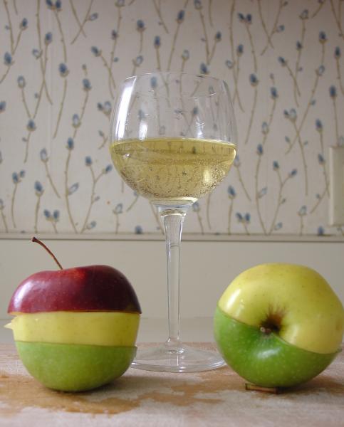
Can tell you spent time setting up this shot. A solid color background would have improved it, I think. Right now you can see a portion of an electrical outlet in the middle right side. It looks like you tried to crop it out as much as you could, but it's leaving unbalanced space on the left side of the left-most apple. The table pattern is a bit distracting, and there appears to be a loose stem hanging around next to the apple on the right. Point of view is good. You are on the right track here, but when compared to other shots in the challenge this one is not quite as strong. Overall, a decent shot.
Pity you couldn't quite get the apple slices on the left to line up as well as the ones on the right. Nice concept. The section of power outlet (phone outlet) at the right is distracting, though.
i really like this photo, but i don't like the title. Should've left out the light-switch plate on the right. Still, the overall quality and design deserves at least a 7 or 8...
All the focus is on the glass. Thats fine but the wallpaper is distracting to the shot. I think this would of worked much better with a plain bg and a little different composition. You can sure cut apples well.
This is a good shot, but the background and the ground are very distracting and take a lot away from what would have been a superb shot had you had a solid background and surface and a more focused picture.






 Add photograph to your favorites
 Add photographer to your favorites

 Photographer found comment helpful.


