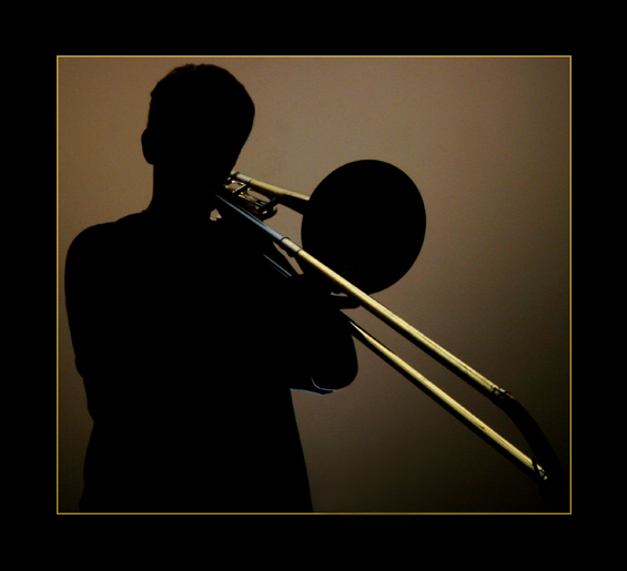
Photo was taken in totally dark room. Subject was standing 10 feet from rear wall and 6 feet in front of camera. I then turned on the cameras delay timer. During timer delay I positioned myself behind subject, on the floor.
When shutter opened, I burst a single flash up and slightly to the rear wall. This created the silhouette, and the bounce from the ceiling lit the top of the trombone.
Photo was cropped, spot edited to remove digital noise, 10% increase in contrast, and border added. There was also a hole in the wall near the bottom of the shot that I cloned out. (Very difficult to clone perfectly with gradient lighting.)
Statistics
Place: 9 out of 248 Avg (all users): 6.8680 Avg (commenters): 8.4516 Avg (participants): 6.9520 Avg (non-participants): 6.7840 Views since voting: 10104 Views during voting: 390 Votes: 250 Comments: 38 Favorites: 5 (view)
I like how the hues here play to the "warm" tones - browns and golds. I do like the subject and the angle presented is interesting but it presented some challenges and some drawbacks. The trombone player remains in the shadows (which I understand was the challenge of the contest) such that more attention is focused on the trombone. The front of the trombone appears as a flat circle with no defining features - if just a little more light could have been shed just on that spot to show the curve of the metal inward to a darker opening where the music bursts forth from, it would have further defined the object as seperate from the head of the player. Not to mention if that spot was illuminated a little more it would give a better sense of depth. Also I would have liked to have seen more distiction in the fingers of the trombone player. They would still be in shadow for this is a shilouette but it would have been nice to see the fingers "dancing" upon this instrument as it is played such that it helps invoke the imagery of music played in the viewer's ears.
Thank you all for your kind feedback. The competition was very strong this week with so many great photos. Looking forward to the challenges this summer.
Nicely done. One of the few examples of heavy border that's working in this challenge. I only wish the curve of the end of the slide were separated better...
Excellent... I have to say I hate the border... if the image was the size of the overall frame I think you would do better... having said that, this is just my opinion. I really hope this does well.. on second viewing I am bumping up (for the picture and not the border! :-) )
I really like this image with the person being a perfect silhoutte yet your lighting allows us to see the brass of the trombone. The only downside for me is your border overkill and I think it damages an otherwise great image. The gold trim is great but the black shouldn't be more than 4-8 pixels per side IMHO. Good Luck.
I LOVE this!!!! I hope people aren't bothering you about the border (they usually do) because I really think it adds in this one. The thin yellow border brings out the brass. This appeals to me the more I look at it. Very well done. 10
Very crisp lines on the silhouette wonderfull lighting. One of the few man made silhouettes in the challenge not just showing of the female form. (not that thats a bad thing). I absolutaly love the way the hron climbs out from the shadows. The only one of it kind in the challenge, Great shot. 10
This is very nicely done in my opinion..allowing the light to catch parts of the trombone adds another dimension to what could have otherwise been just a "run of the mill" silhouette.
lighting is to die for. i think this framing/presentation would work well for print, but i don't like it as a digital image. the thick black border detracts from the focus on the photograph.
Very cool how the trombone is just lighted and the rest is silhouetted. I like the border too, though I know lots of people will probably complain it's too wide, I think it's fine because the line isn't too terribly bright relative to the image itself, as I've seen too many times.
Very nice transition form true silhouette to lit subject. (don't know how else to say that) Very nice lighting. Good background color choice. I thought I didn't like the border, but the more I look at it, the more I see that it works quite well with this photo.
Boarder is too much.... I think its that pinstripe... very loud. I won't take off for your amazing photo based on my personal distaste for your boarder. 9.






 Add photograph to your favorites
 Add photographer to your favorites


 Photographer found comment helpful.


