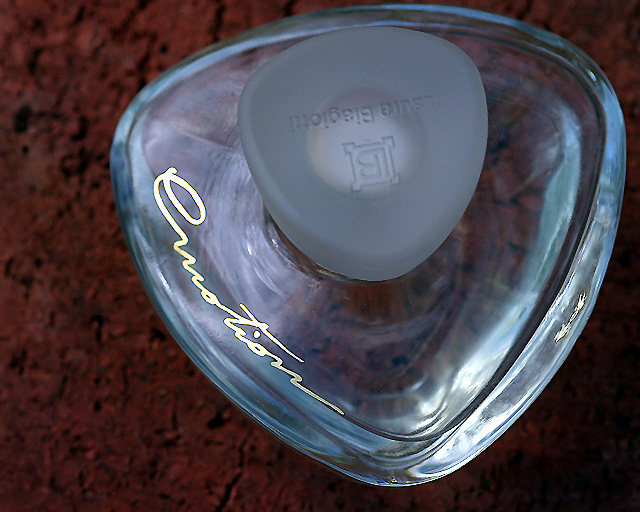
Hmmm - the thumbnail for this photo certainly doesn't do it justice. Very nice lighting to get such clean looking glass. I wish the background was different however. The color and texture just don't appeal to me. And I wish the text on the lid was not upside down.
Beautiful advertising piece, could have worked in the jewelry challenge too. I love the isolation from the background and the lighting. If you could just have turned the top 180 degrees so the name could be read normally :-) ...








 Add photograph to your favorites
 Add photographer to your favorites


 Photographer found comment helpful.


