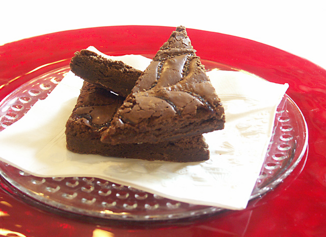
The lighting is done badly. No dimentions shown. There is no shadow to paint with. And there is this strong light coming from behind that is changing the colour intensity - bad thing to do. The angle is so strait forward - uninteresting. It seems so pale and flat. There is a triangle thogh. Try to make the image more interesting by using light and shadow to your favour. Using shape is more difficult. Keep trying I give you a 4 I guess . But you could have easily bumped it up a lot higher
The composition is good,my eye keeps being pulled to the red outer edge on the right, I believet he image would have improved with a more central position...7
this one aggravates me, i want that brownie. So much so that I will not stop until I go all the way to the store buy me some, come back, cook them, and i will be eating them by 7:00 tonight. Good shot! LOL





 Add photograph to your favorites
 Add photographer to your favorites


